or
The challenge over at Less is More this week is
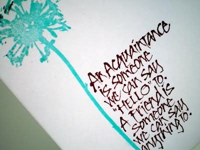
A One Layer Card with the SENTIMENT
as the focus of your creation.
as the focus of your creation.
I can't decide which placement I like best. Usually it just pops out at me,
but not this time!
I just keep changing my mind!
So I'll just have to pick one as my entry!


28 comments:
I love this. My vote is for the sentiment next to the stem, but both work wonderfully.
Well my vote goes to the overstamped one, it looks as though the sentiment is the vase! Whatever you think they're both great!
Enjoy the rest of your week.
Chrissie
"Less is More"
They are both beautiful. If I had to pick just one I would lean towards the second with the sentiment next to the stem but really they are both wonderful. Thansk for sharing and have a great day. Angela
Brilliant cards, the sentiment is lovely. Hugs Rita xx
Both are beautiful cards, my vote is for the overstamped one.
Christine xx
Great color combo..and I love the sentiment. BOth are great, but I think I might like the second card the best.
Love the colours, both are good but think I prefer the second one. :)
Kath
Great cards.....I like both actually !!
I like both, now I can hear Harry Hill in my head :/. Think the second one is my favourite
Great cards - slightly prefer the second one because the slightly broken lines of the font mean the visual "interference" from the stem adds a little too much confusion for this proofreader's eye!
Both version of your card are beautiful but i prefer your second one as i sometimes struggle to read things that are overstamped. Stunning creations, love your colour choices and i AdOrE your dandelion stamp:-)
Love both versions and can't decide which I like either, sorry to be no help!
Love both but if I had to choose would probably opt for sentiment beside the stem.
Kathyk
They're both lovely but I think the overstamped one has the edge. xx
like them both equally.
Brilliant card Rachel
I love the first one, if I was gonna stamp it to the side, personally 'd have done it the other side, so it only went through the over hang of Acquaintance
Great to see you again
mandi
Less is More
Oooo not sure which I prefer think I'm leaning towards the second version but can see what Chrissie means by the overstamped one looking like a vase.
Great colours and good stamp, my preference is for the 2nd card as I found the sentiment easier to read, but that is probably my age!
Kath x
Love the first one - the overlap is great. Love your bold yet elegant colours!
Sarah at 127
http://blueboxbabe.blogspot.com/2011/04/less-is-more-goes-grungey.html
This card truly is less is more. Its beautiful and very rich in its simplicity.
I love the second one - the colours and sentiment are lovely
I like your first one too. Fab sentiment. x
Rachel, these are fab, great image and sentiment. I've been scrolling up and down trying to decide which one I like best, think they both work but maybe the first one has the edge - it's a bit more 'arty'! xx
Yep, they both work for me, although my personal fave is the overstamped one.
I can't decide which I prefer, they are both lovely. Sarah
Doesn't matter which I think both are just FABULOUS.
PS Thanks for the comment on my card
I love this! My preference would be the one that you stamped the sentiment over the flower- love the splash of aqua!
Really great cards, yes I think I prefer the second... oooh not sure....but absoloutely scrummy colours you've chosen!!
Diane x
(Thanks for popping by my blog and your lovely comment)
Post a Comment